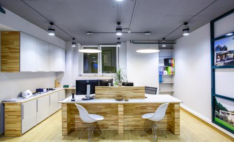
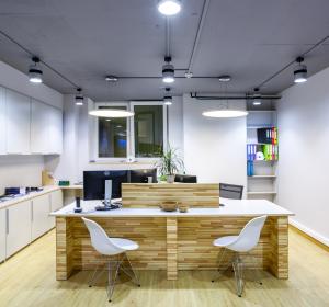
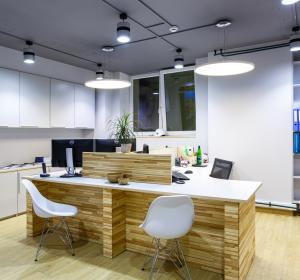
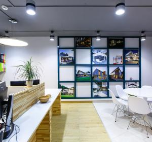
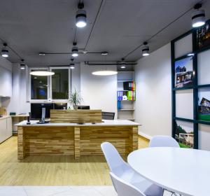
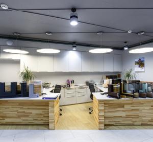
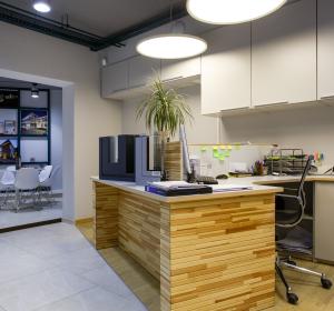
The premise initially had plenty of evident disadvantages: location in semi-basement, lack of windows, low ceilings, complicated configuration. It is impossible to mask such serious disadvantages so the task was to transform them into advantages. For example, corner location of principal premises allowed to create a dynamic diagonal axis which help visitors to understand where to go. Also I used this space disadvantage as a reason to order tailor-made furniture instead of standard office one. The Customer agreed with me and was satisfied with the result.
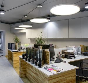
It was impossible to conceal engineering networks under the suspended ceilings because the height of premises was too low. As a result the engineering systems became a full-fledged elements of interior design: central heating pipes and cable trays were painted in accent emerald, electric cable traces was drawn by me using artistic approach aimed at turning engineering elements into a drawing in accordance with the design project.
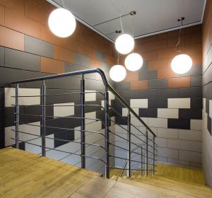
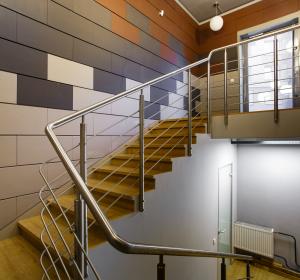
Walls of dark staircase going to the office became an original canvas for demonstration of terracotta panels, modern and ecofriendly façade material, where the group of spheroidal lamps looked like a fancy lighthouse catching attention. Stairs of the staircase were partially altered and covered with ceramic parquet, which on the whole replaced the possible apprehension of the guests with interest to the surroundings.
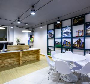
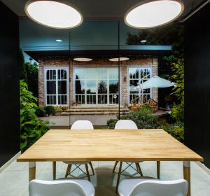
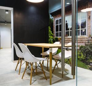
The staircase goes to the conference room where video presentations are possible to be held. Walls of this room are covered with graphite paint which makes it possible to draw sketches and make notes on the wall during the meetings with the customers. A sliding glass partition in the conference room is decorated with a picture of the project implemented by the company. This solution again demonstrates the materials and services delivered by the company and conceals functional space for employees: a small kitchen and a toilet. There is an exposition zone in the big office hall for samples and structures.
Special attention was paid to the use of safe materials in decoration of emergency exits in compliance with fire-protection regulations for design of public premises.
It was important to provide a correct lighting concept: location and capacity of lighting devices was verified via lighting technical calculation. The majority of lamps in the office are LED for energy saving purposes.
Нежилое пространство PROJECT DETAILS Color solution:
Generally I used natural self-shades in the interior which supported a general ecofriendly concept of the company’s activity. The so-called spoonerism game seemed an interesting solution: the ceiling was painted dark while the walls and the floors were in light colors. Project emphasis:
Working zones were equipped with tailor-made furniture made according to my sketches. It was also important to design enough working space for employees specializing at voluminous samples which should be available to them at once. The furniture was decorated with a natural plank made of crude wood. The staircase was decorated with façade terracotta panels, a modern ecofriendly material which the company sells. The decoration of the staircase demonstrates to the company’s clients both material and ways of its assembly. Interior style:
Scandinavian. Manufacturing companies: Italon, Svetovye Technologii, tailor-made office furniture made by Russian manufacturing companies according to individual project. |
ENG


