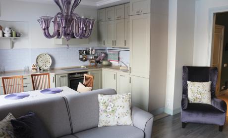
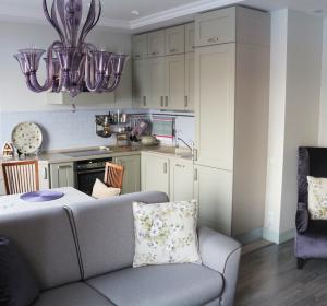
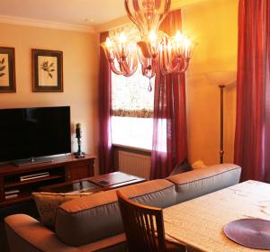
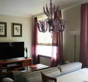
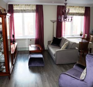
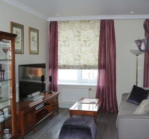
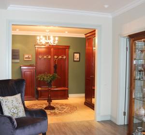
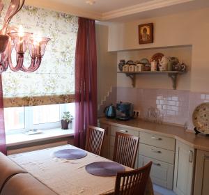
Catastrophic lack of natural illumination in the apartment was the main difficulty of the project. There were just four small windows for the area of 80 sq.m. and besides there was a glassed-in balcony in one of the rooms which also swallowed up the light. A developed illumination concept, delicate colors and almost free space became a good solution. General lighting was provided by alabaster spotlights, while modern decorative classic lamps were responsible for local lighting. Also additional lightening of the apartment was achieved by use of light colors with light-reflecting effect in decoration. Besides I used light natural textile instead of heavy curtains at the windows for this project. In order to fill the space with light and air I decided to separate the hall and the kitchen-sitting room with a wide portal without setting up screens and doors, as a result of which we got highly open prospect.
At the first meeting with the Customers at the object I understood that ventilation channels in the premise work with backdraft. Such status of air exchange could lead to potential troubles with comfortable living of the owners and was a danger to their health. The issue was solved through applying to the management company of the house.
Also entrance door was moved due to rational layout, which was approved by official authorities.
During the construction works difficulties occur due to construction workers’ carelessness. As a result the construction brigade had to be replaced, which extended the terms of renovation process.
Жилое пространство PROJECT DETAILS Color solution:
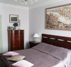
Delicate colors and pastel shades with emphasis on compound neutral hues – gentle green and lilac, light pistachio green and light blue – aim at creation of deep space. Project emphasis:
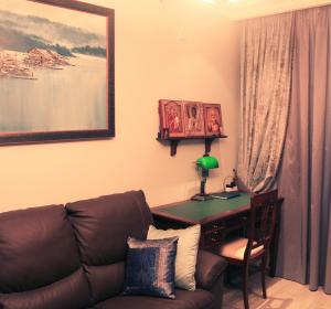
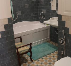
In this project major attention was focused on details. I worked out design of combined carpet porcelain tile for the bathroom of colors selected within the design project. Interior doors were painted in light pistachio green colors on a by-order basis. The kitchen design was also in the focus of attention. Together with the Customer we carefully selected textile, lithographs and pictures on the walls. Interior style:
Modern classic. Manufacturing companies: Topcer, Ceramica Vouge, Cerim, Simas, Nicolazzi, Voltolina, Fineza-Puerta, the Maria Russian furniture manufactory. |
ENG


